Category:
Category-1
Duration:
Duration
Navigating the Green Path: Designing Blueearth's Website & Branding Journey
(Project overview)
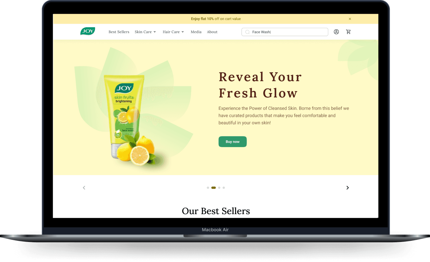
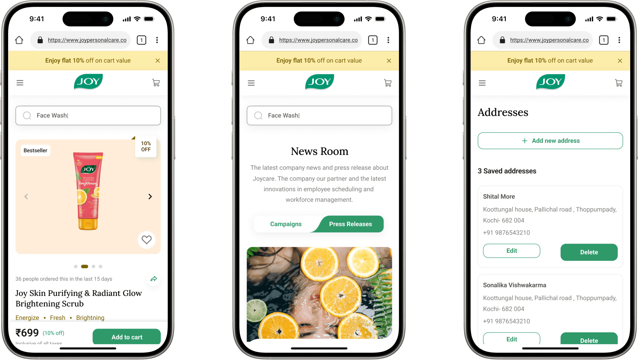
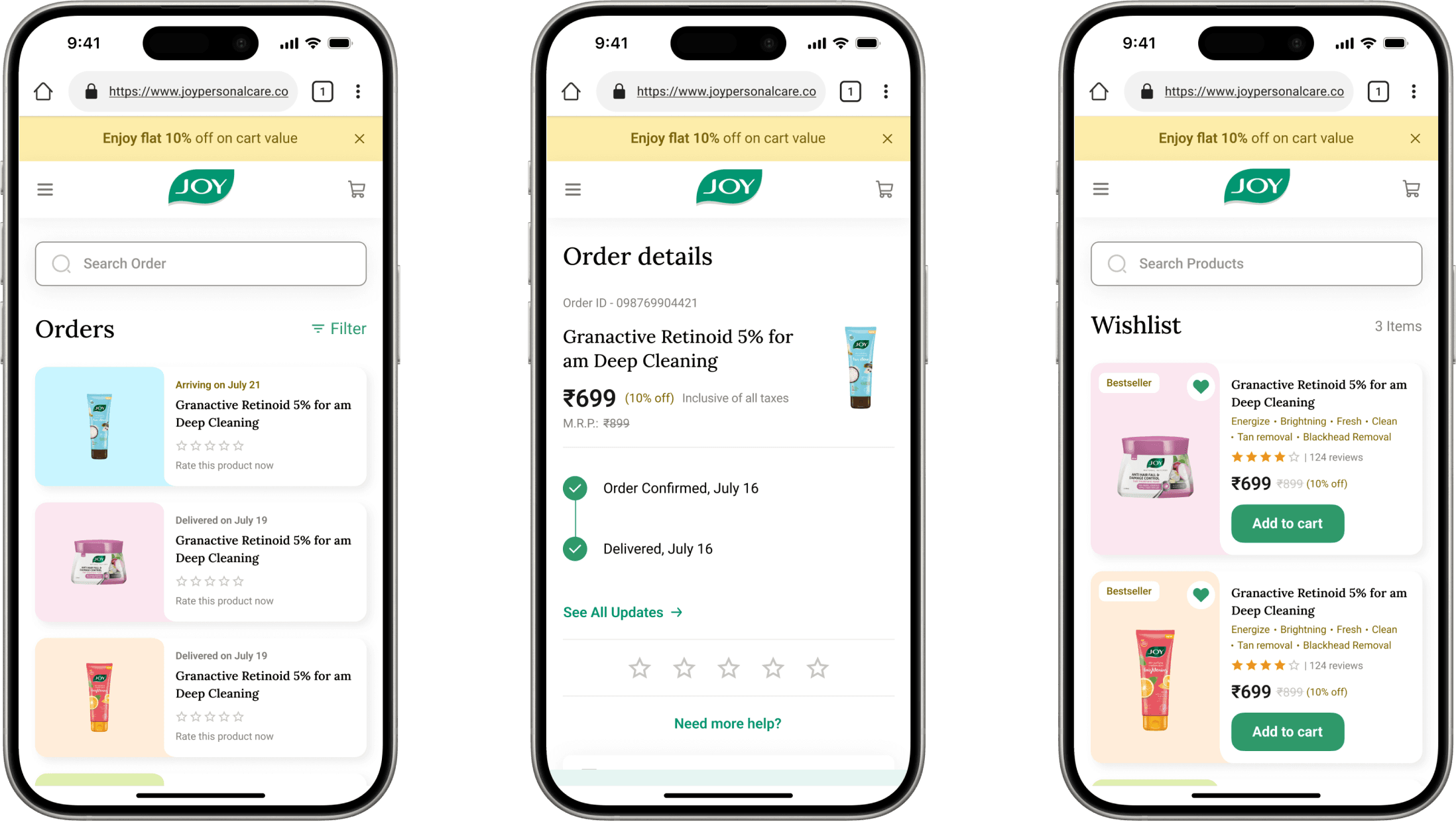
RSH - JOY is an e-commerce brand offering a range of innovative, high-quality & affordable personal care solutions to people across the world. The company wanted to redesign its existing website to enhance its functions and make it more user-friendly, and navigable.
(Problem statement)
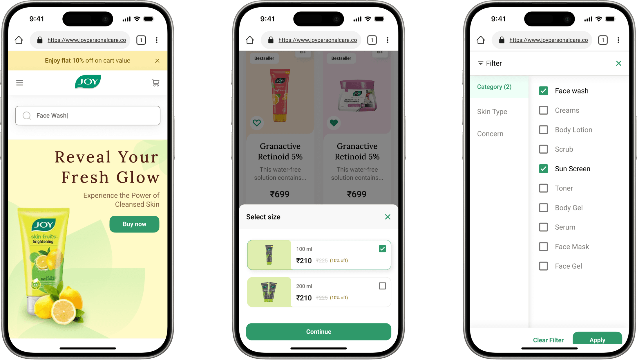
RSH - JOY wanted us to redesign the UI of their website with a simple approach to enhance user functionality and ease the navigation.
(Our process)
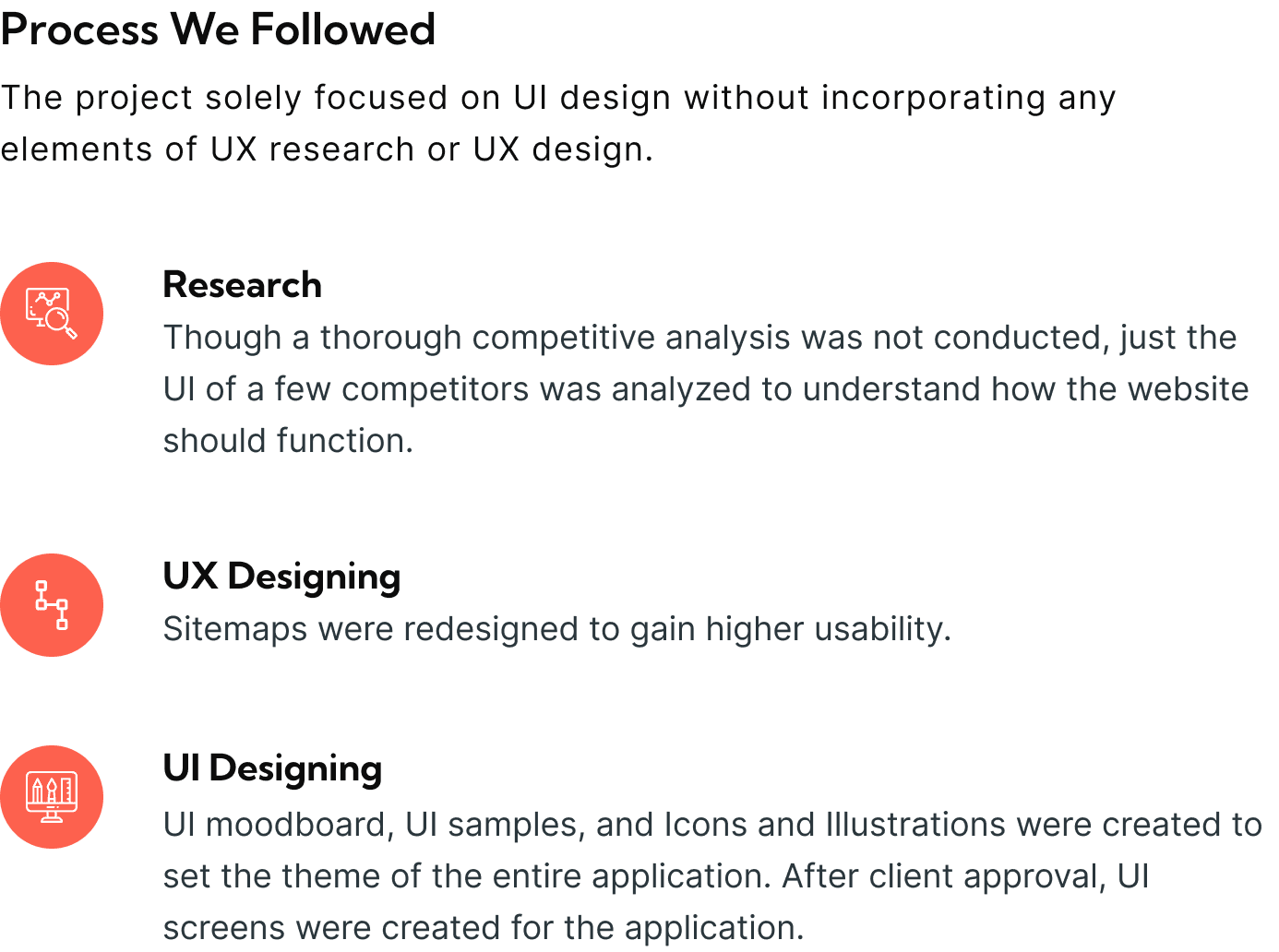
To ensure that the project flows smoothly towards completion, we follow the STEP process which is acronymous to Soak, Think, Execute, and Proof.
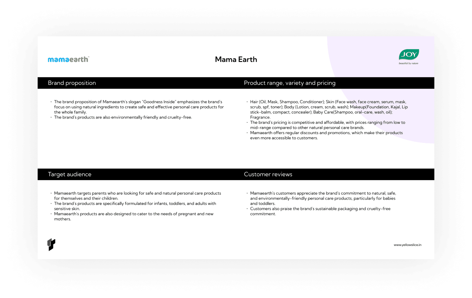
Competitive Analysis
The client wanted us to find the gaps in the current user journey. We needed to understand the features included in the mobile application.
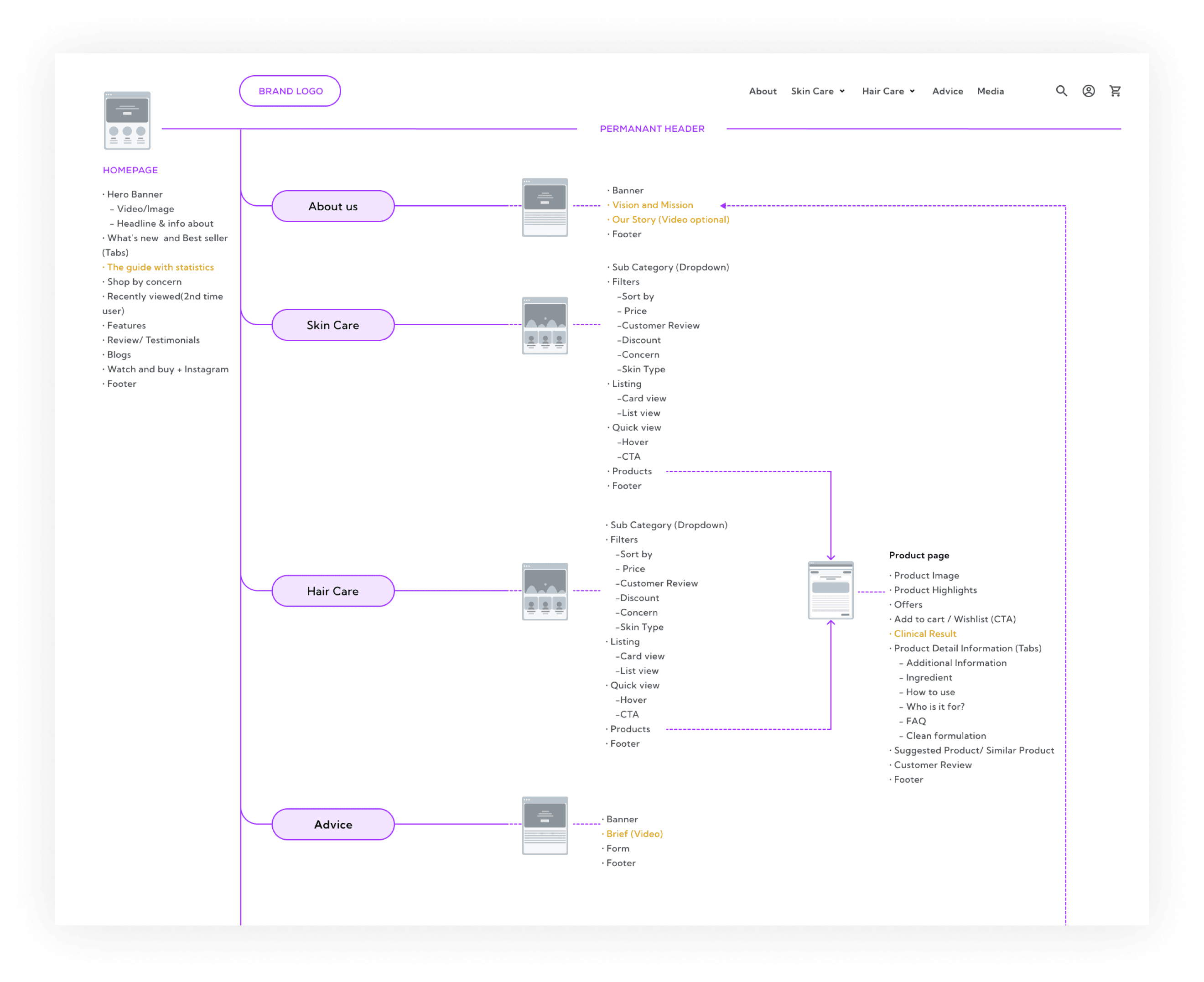
Site Map
The Sitemap was redesigned to improve the usability of the application.
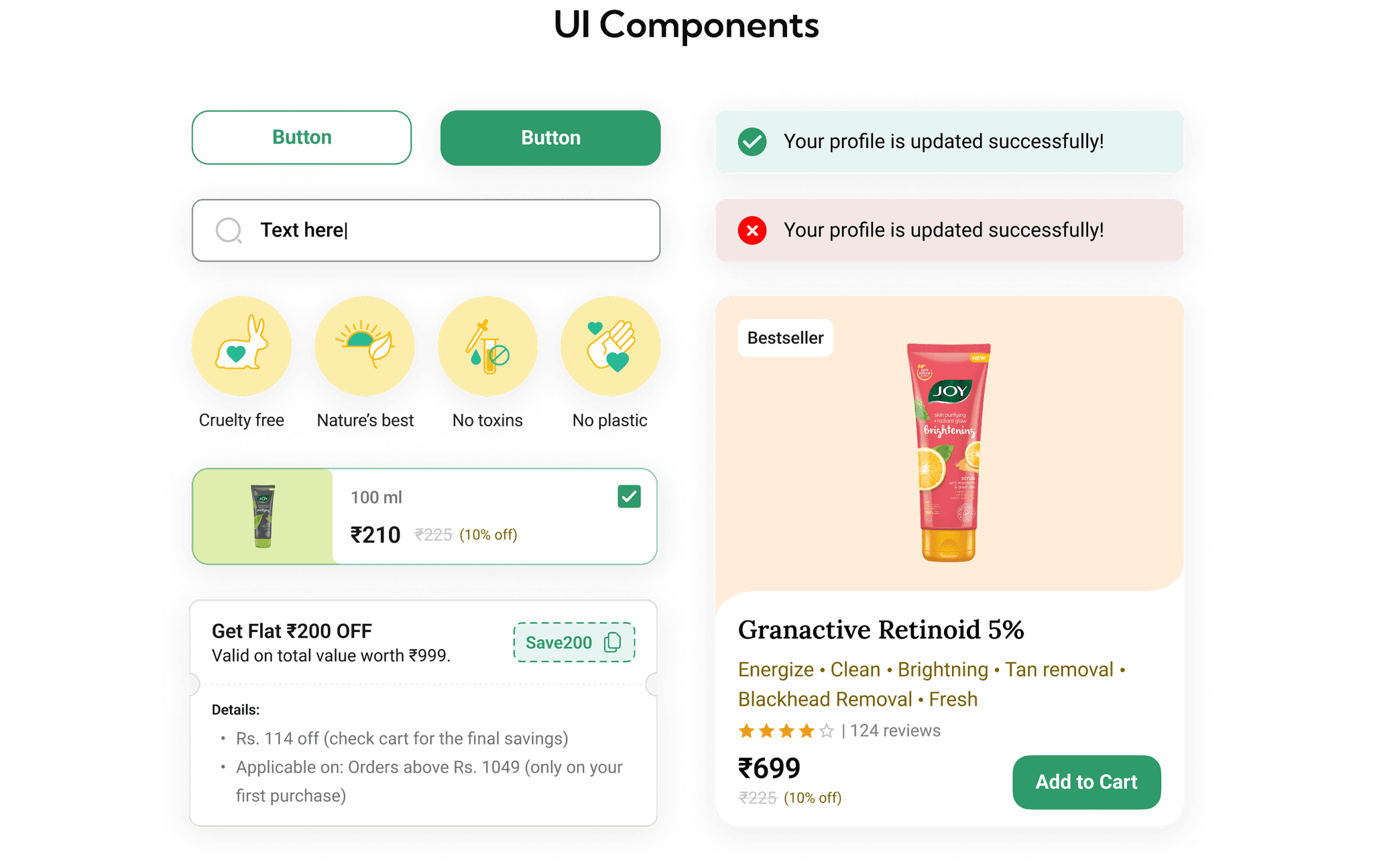
(USER INTERFACE DESIGN)
Typography
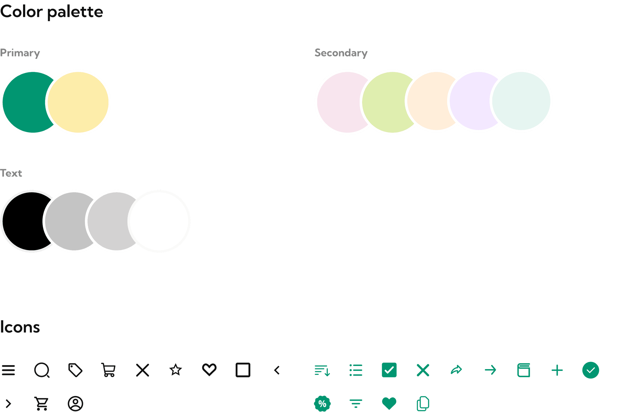
(Colour Palette)
KPI
Post-launch, the site’s bounce rate dropped to 30%, reflecting increased user engagement and longer site visits.
