Navigating the Green Path: Designing Blueearth's Website & Branding Journey
(DESIGN BRIEF)
Design a carbon consulting website for our client that effectively communicates their services and expertise to potential clients. The website should be user-friendly, visually appealing with a focus on highlighting the benefits of the client's services and the expertise of their team.
(CARBON CREDITS)
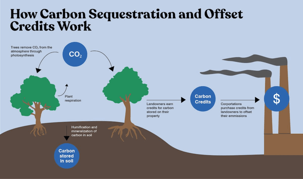
Carbon credits are certificates that represent a reduction of one ton of greenhouse gas emissions.
They are earned by taking actions that reduce emissions, such as using clean energy or implementing energy-efficient practices.
Each credit can be bought, sold, or traded on the carbon market.
(BRAND IDENTITY)
Vision - In 2 years time, Blue Earth will be known across multiple states in India and recognised as a leading brand that has revolutionised the way rural areas combat climate change.
Mission - Blue Earth will be a project developer, project finance and project manager in developing, assisting & managing projects that generate carbon credits.
TYPOGRAPHY
By incorporating Lora for the headings and Outfit for the body text, I aimed to create a UI that communicates professionalism, elegance, accessibility and a sense of seriousness.
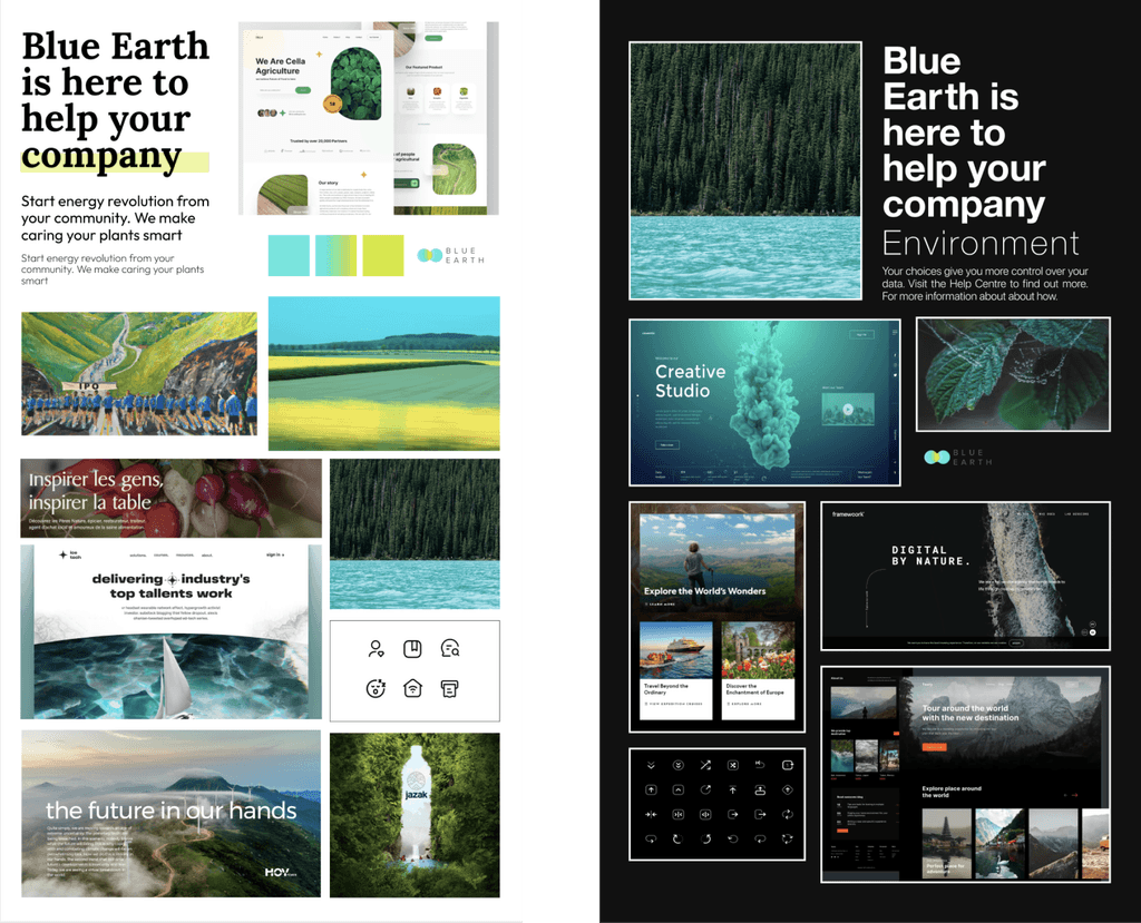
(MOODBOARD)
I made two different mood boards one with light theme and other being dark.
(SITEMAP)
A sitemap aids in streamlining pages and efforts by organising them according to user-friendly classifications.
(WIREFRAMING)
(USER INTERFACE DESIGN)
(GRIDS)
The 12 column grid is an invisible design system that holds a design together. It is a way for designers to tie elements together in order to create visual hierarchy and alignment. The grid is made up of a series of invisible (or sometimes visible) vertical lines that break the screen into 12 separate columns. (artversion)
(ITERATIONS)
(FINAL DESIGNS)


